Adelaide Branding
In Adelaide's infancy, I developed the company's foundational branding - logos, color palette, and initial marketing materials. I likewise developed the logo and website for Adelaide's side project, The Attention Council - an industry group dedicated to broadening the awareness and use of attention metrics in digital advertising.
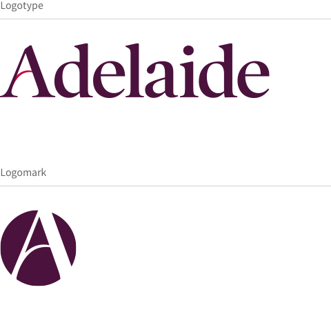
Adelaide Logotype and Logomark
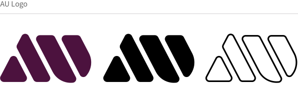
The Adelaide logotype is for general usage, while the logomark is intended for abbreviated use where the brand name is otherwise known or implied. The crossbar of the A imitates an ideal AU performance curve, with delivery weighted toward high-AU.
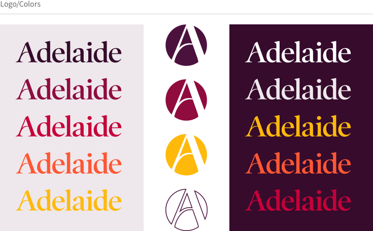
Adelaide Palette & Typeface
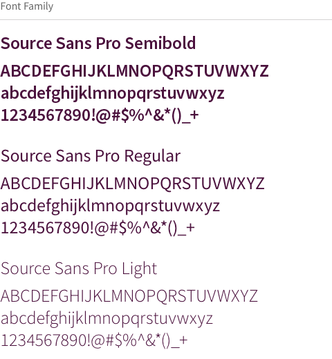
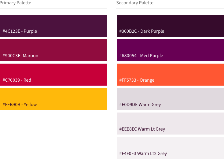
With a base purple and maroon inspired by the city of Adelaide's official flower, Sturt's Desert Pea, the primary palette evokes warmer "sunset" tones to set the company apart from the cooler blues and greens of incumbent competitor branding. Source Sans Pro was chosen for its clean and strong appearance, and for its open source availability.
AU & The Attention Council Logos
AU: As the core metric of Adelaide, the AU provides a cross-channel measure to analyize and optimize campaign performance. The metric's impact and utility is expressed through the logo's bold, abstract appearance.
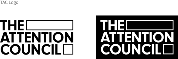
TAC: Developing insights and ideas on the attention economy, The Attention Council is a group of experts across the advertising industry. Co-founded by Adelaide, I developed the group's logo and foundational branding.
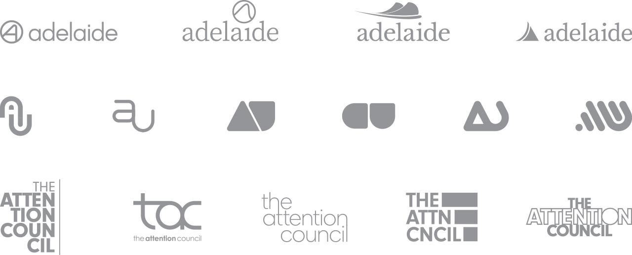
Logo Concepts
Select samples for a few of my Adelaide, AU, and TAC logo concepts.